Case Study
Kato Baking Supplies
Conversion-focused, multi-thousand product variations
Heavy ecommerce
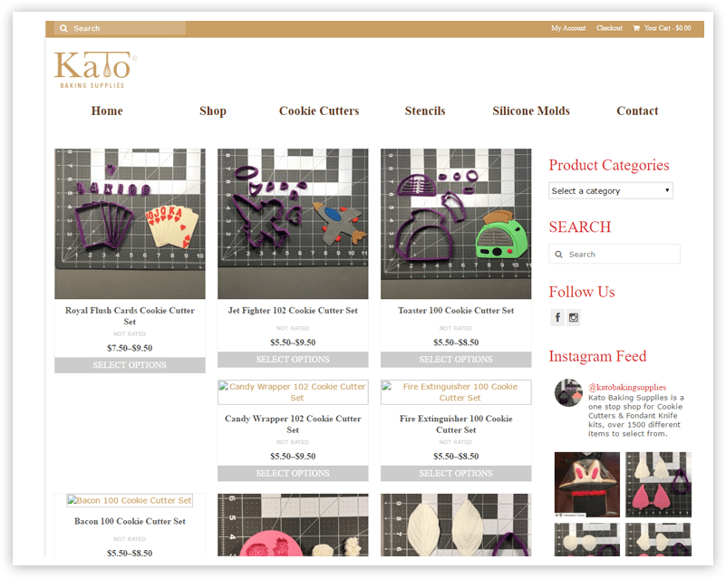
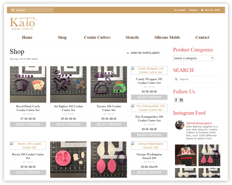
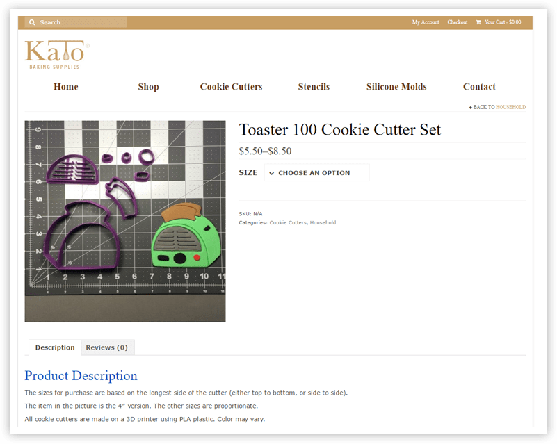
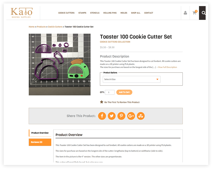
With thousands of products, Kato Baking Supplies was initially worried about the speed and performance of their website, especially once traffic starts getting pushed to it. In addition to an unimpressive design lacking that “wow factor,” there were some development issues making the check out process impossible. Kato also needed to add incentives to their website such as coupons and discount codes.
The client wasn’t able to receive orders because of a bug, so the checkout process needed fixed immediately. Before we began any design work, our team was quick to fix the bug and had them processing orders again in less than 2 weeks.
Products Offered
Unique Ways to Shop
Page load time (sec)
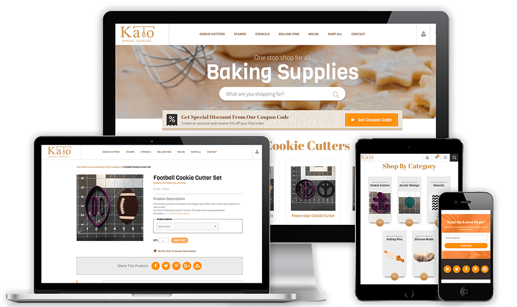
The Results
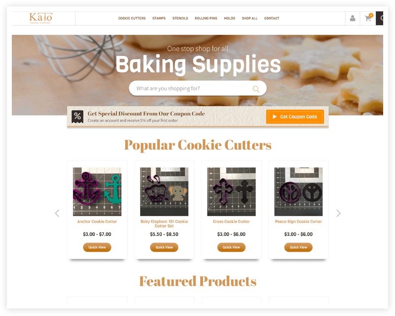
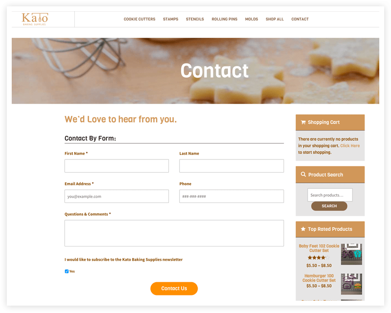
This homepage gets right to the point, no messing around. Their most popular and featured products are displayed first, showing off the goods that will take you right through check out with a single click. As for those incentives: The user who lands on the page is immediately given a reason to buy. A reward is waiting for them before they ever scroll down the page, encouraging the customer to sign up and make a purchase. And with a newsletter, Kato can now regularly keep in touch with their customer base and hone in on repeat business when they’ve got something new to offer. The wholesaler also gets special attention and is offered a sign up form on site where they will have access to even greater deals.
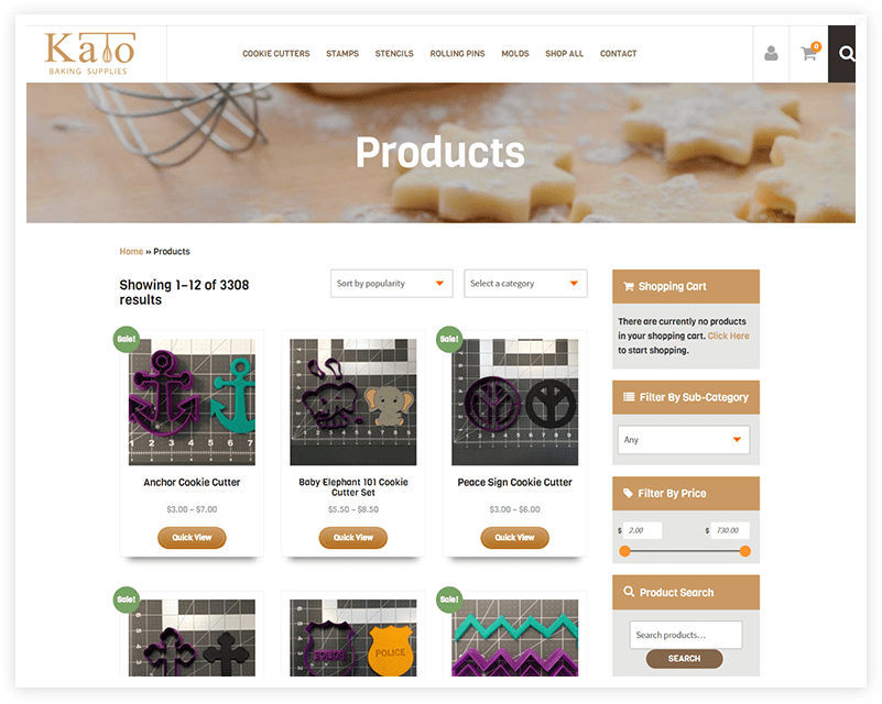
The multi-thousand products and high traffic this site will face is a piece of cake. Kato Baking Supplies loads in under 3 seconds and will reduce staff time on the phone significantly!


