Case Study
Smith & Shapiro
Bringing relevancy & credibility to a proven law firm
Be Credible.
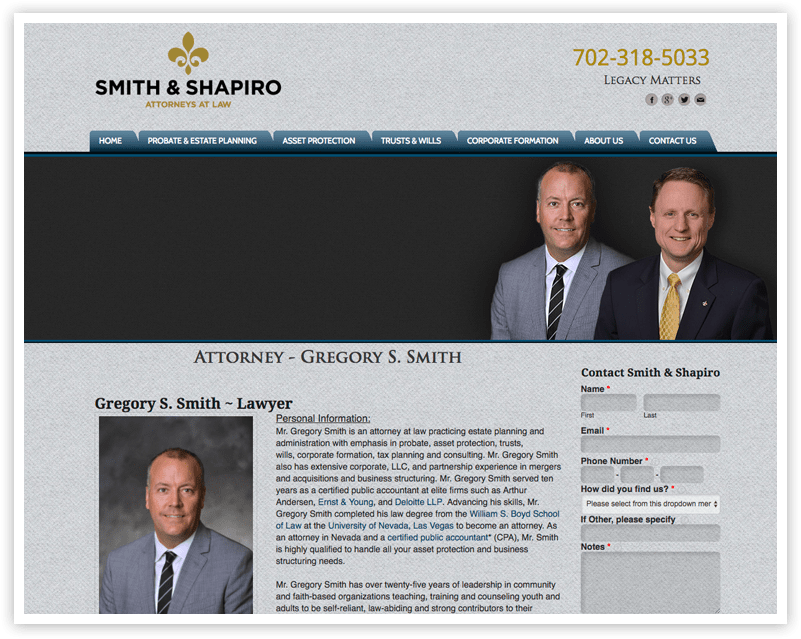
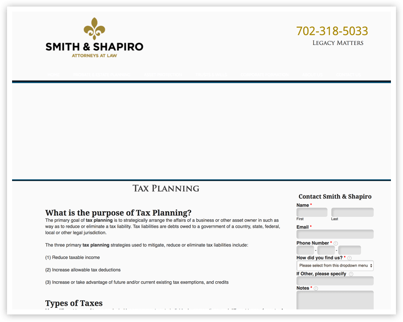
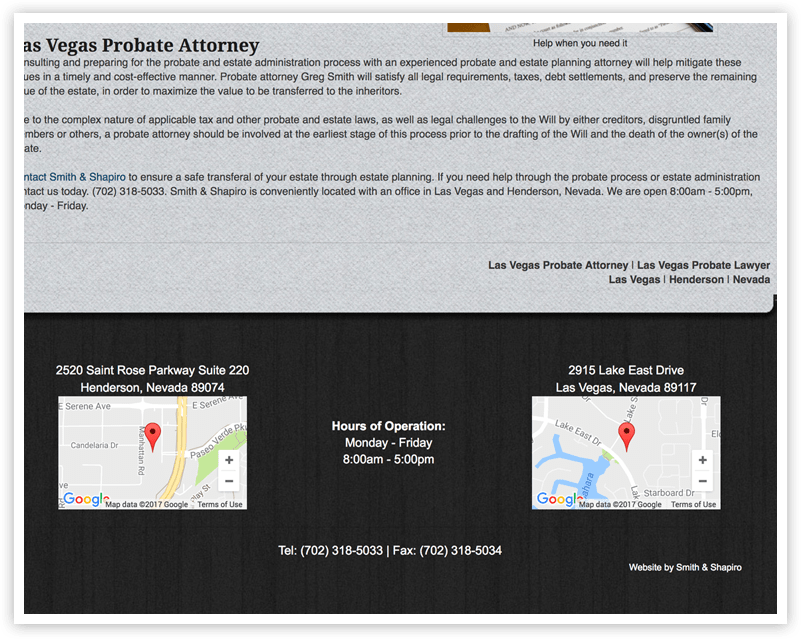
Smith & Shapiro has over 20 years experience dealing with estate matters and approached us needing a warmer and more personable online presence. The website was outdated and lacked the credibility that seals the deal when clients inquire online.
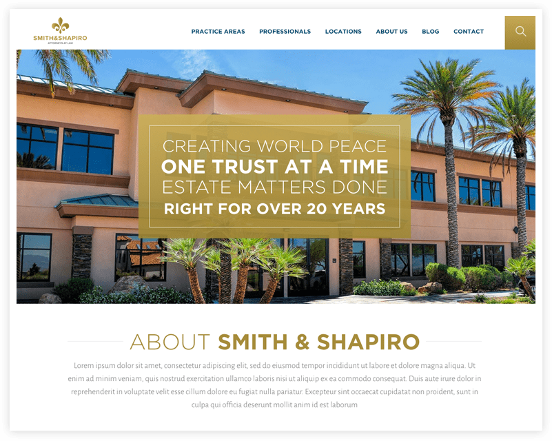
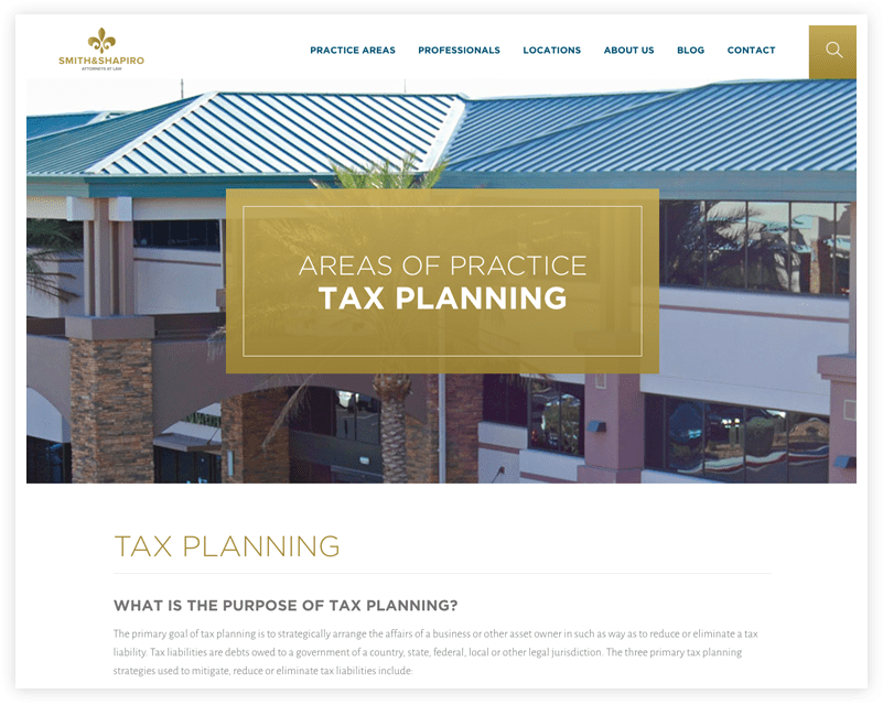
In addition to the firm’s practice areas not accurately being portrayed, the site lacked the airy openness and modern look of their office location at the Atrium in Henderson.
Consistency from Office to Web
Time Spent on Page
Page View

The Results
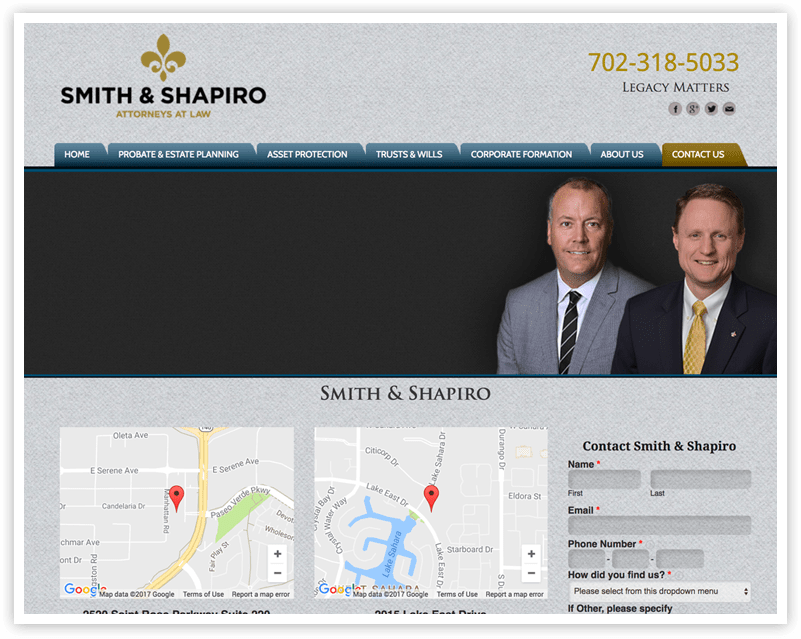
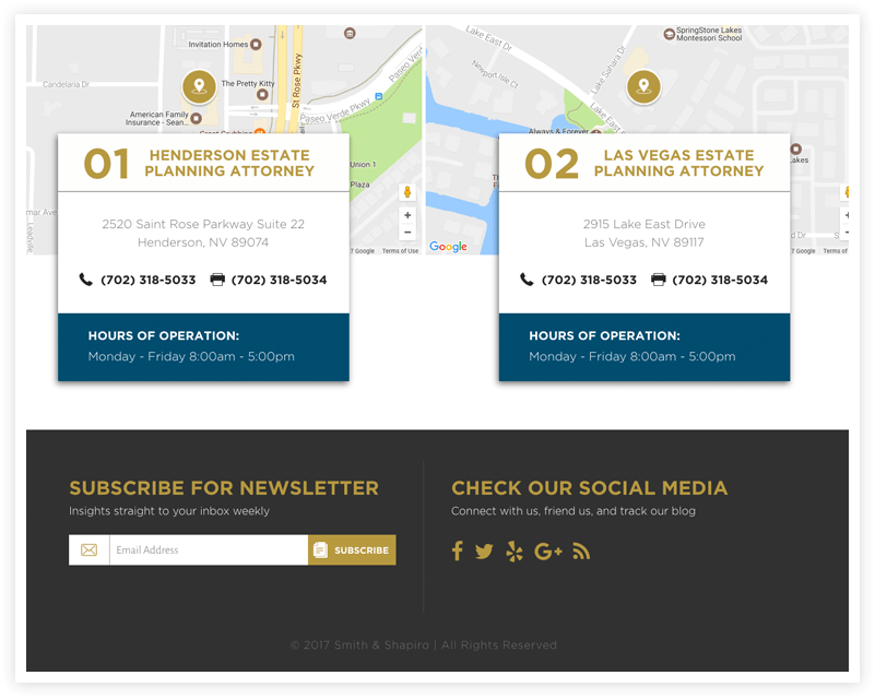
Because Las Vegas is flooded with attorneys, we wanted to set Smith & Shapiro apart with sparkling reviews from multiple sources and display their 2 convenience office locations as interactive maps. The firm’s practice areas are highlighted in a modern, full width grid display that intuitively invites the user to click and continue learning about the company.
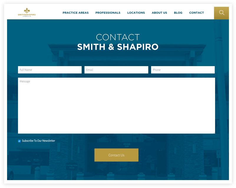
Finally, the user is driven to a large call to action prompting them to contact, with a large image of their building in the background that instills credibility and legitimacy.


